I started this project a few months back while I was still figuring out how a design college works. Back then I started off with limited exposure, but it resulted in this outcome. If I were at college it would have been a totally different experience amongst my peers and professors. Yet, I am not disappointed with the work that is on the table.
Ideation
I like exploring fonts in my visual designs. Fonts are the primary tools in my projects and are my main strength too. One day, a friend of mine introduced me to the font ‘FUTURA’. Although it didn’t amaze me at first, as I learnt and explored the font, it felt like nothing could suit better for my project. A lot of ideas in and out of my creative space, a bit of trial and error, some fun in the process – all of these helped me gravitate towards a finer concept.
Concept
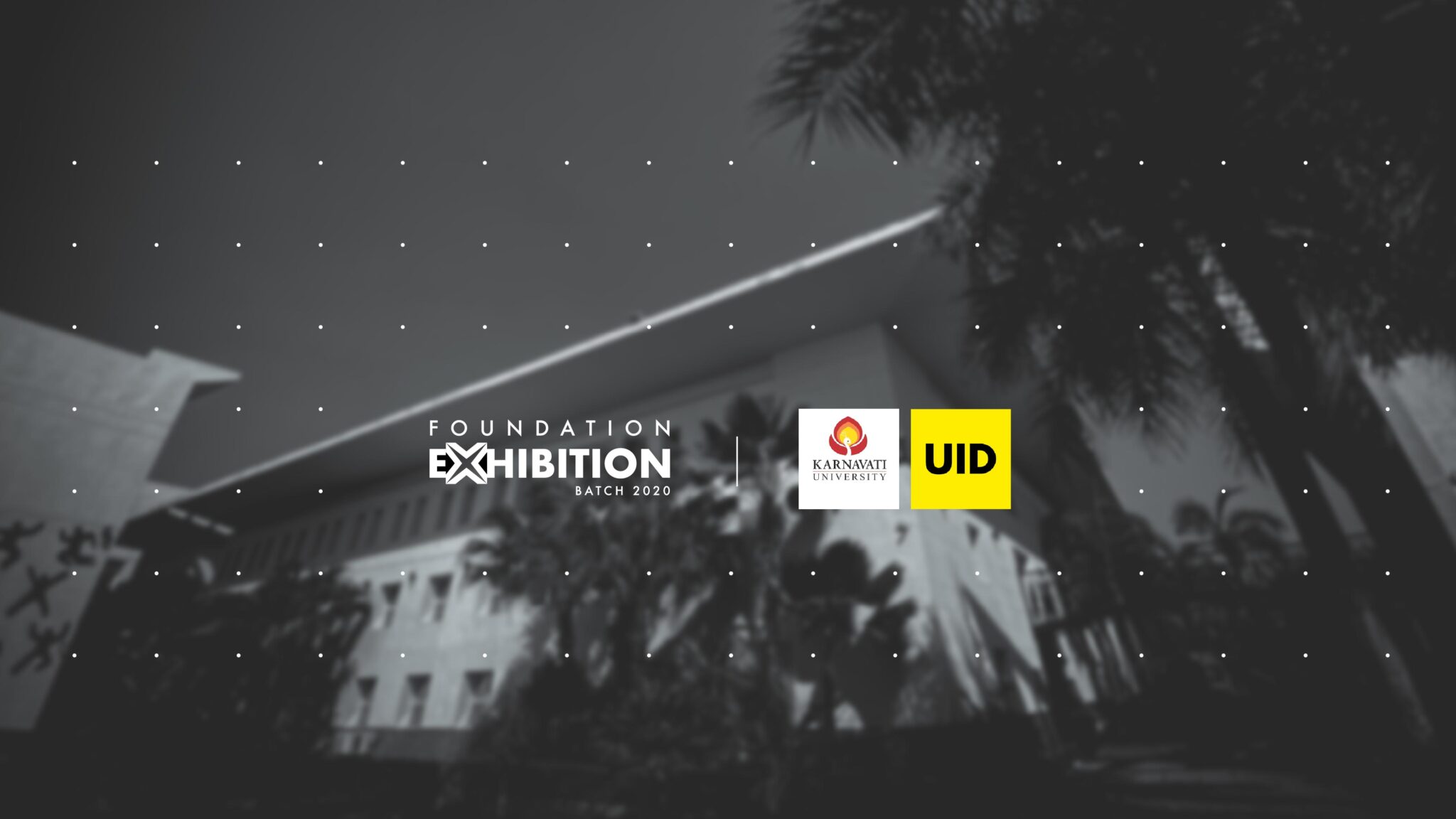
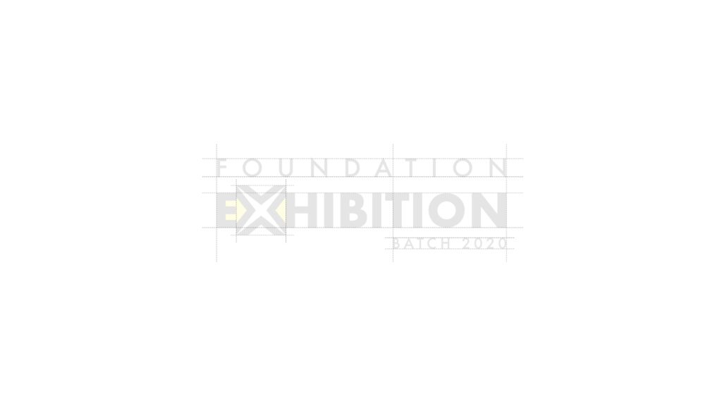
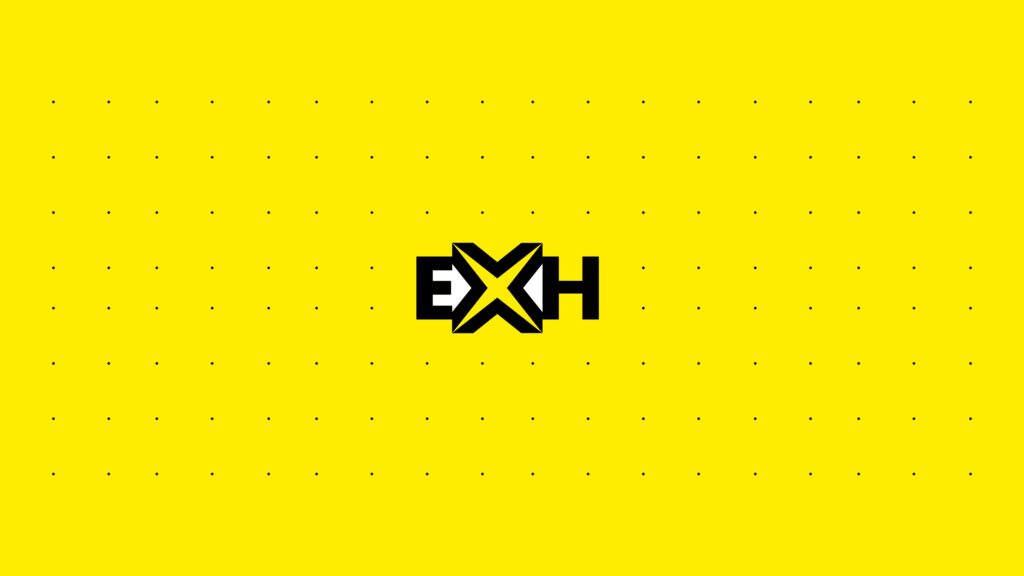
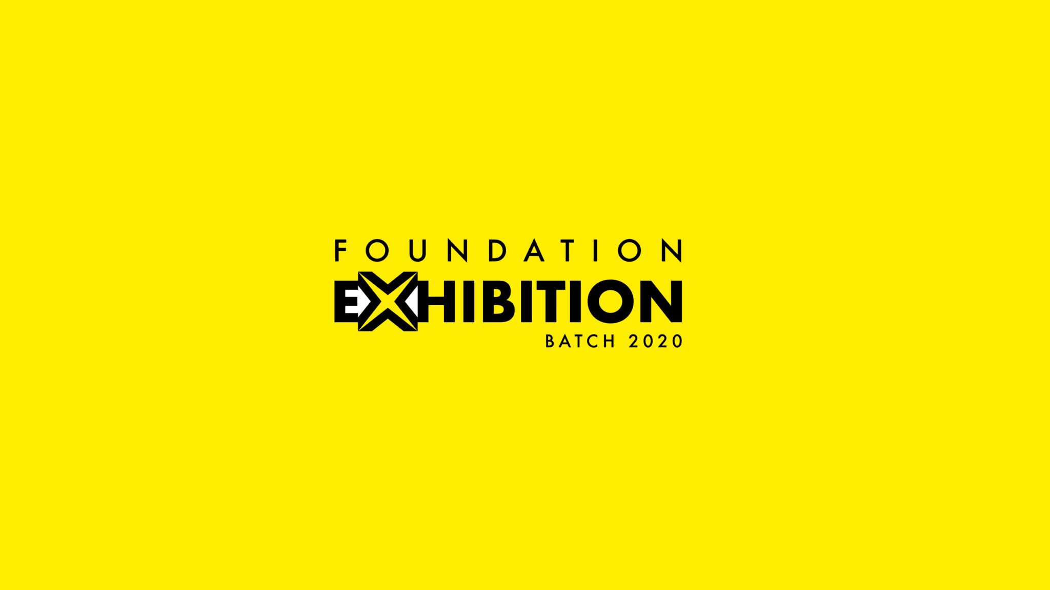
After tonnes of explorations, iterations and feedbacks, I arrived at the following conclusion. The typography is the highlight again. The letter ‘X’ is made in such a way that it forms a home and a rewind button from its negative spaces with the adjoining letters. The home icon represents the constraint of being limited at home yet creating wonders. The rewind button was a happy accident. As a designer, it is important to reflect and learn form your experiences. This is a symbolic representation to stop and look at the learnings of the past year in college. The exhibition provides a platform for aspiring designers to not only rewind their process of learning, but also to present it to a bigger crowd.
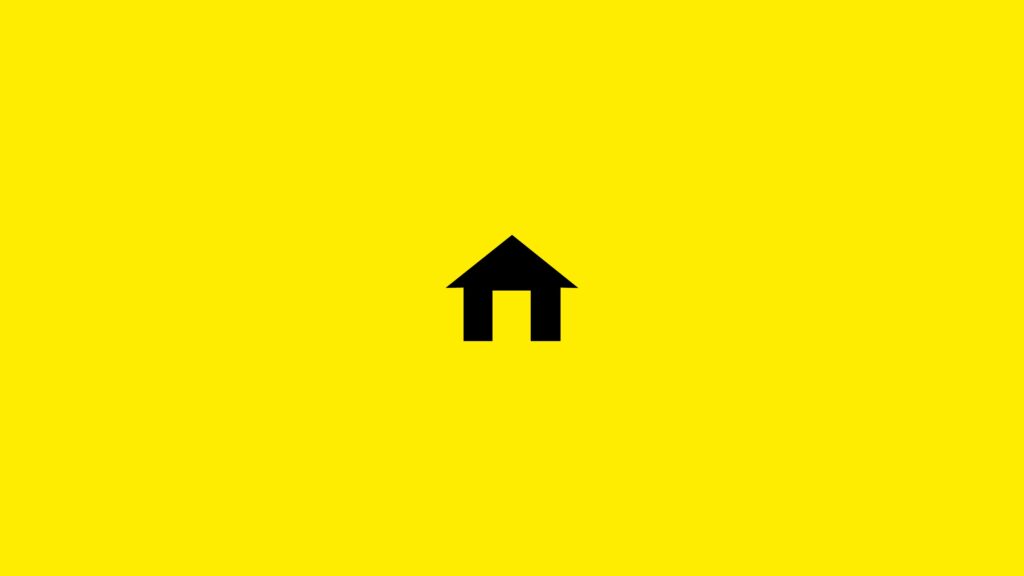
Online Exhibition – faculty and students to be safe during this COVID pandemic. As a result, using an online platform allows everyone to attend this exhibition from the comfort of their respective homes. Hence I added the home icon in the logo.
Rewind – Rewinding to our past helps us learn for the future. What we learn in our foundation helps us build a brighter future as aspiring designers. Hence to show the importance of rewinding I added the rewind icon in the logo.
Logo & Icon
The color scheme stands out and is easily recognizable as a product for and of UID. It aptly embodies the brand appearance of the college. The decent and sharp edges fulfil the purpose successfully. This logo as a whole looks elegant and readable. This icon is one of my best designs yet and through this I present to you my skills and learnings in the field of design.
Final
It was an honour to design a logo for the college exhibition. I would like to express gratitude towards my professors who guided and appreciated my logo design. As this was my first year in college, it was a thrilling experience. The overwhelming response from my friends and faculty was like a cherry on the cake.
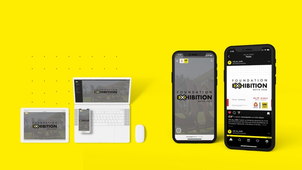
Mockup
This is a mockup to showcase my design in various layouts on different devices
I am glad to have reached here and take immense pleasure in presenting my work. I will keep working with the same enthusiasm and update you with more projects. I wish to thank my tutors and guides without whom this outcome wouldn’t have been the same.