TUORRA aims to create a market for natural, eco-friendly cosmetic products and germ killers, aromas, and mosquito repellents sourced from the Western Ghats. Kind of Selfcare brand. The brand wants to become the top choice for environmentally conscious consumers seeking high-quality, natural products. TUORRA’s essence is its commitment to using real ingredients from the Western Ghats while ensuring eco-friendliness and premium quality.
Problem
User is having difficulty finding organic and natural products.
It’s challenging to locate items with clear ingredient lists in the market.
Traditional repellents and scented products with chemicals often lead to allergies and health problems.
Brand Archetype
The Innocent Archetype
Audiences / key stakeholders
Age: 18-45 years old. Gender: Primarily female, but inclusive of all genders. Location: Urban and suburban areas.
Competitors
Forest Essentials, Khadi Natural, Kama Ayurveda and SoulTree.
Vision
Our vision is to lead in providing ethically sourced natural wellness products from the Western Ghats, enriching lives while preserving purity.
Mission
Source and craft premium natural products from the Western Ghats, prioritizing authenticity, sustainability, and community empowerment while educating consumers on wellness and biodiversity preservation.
Brand pillars
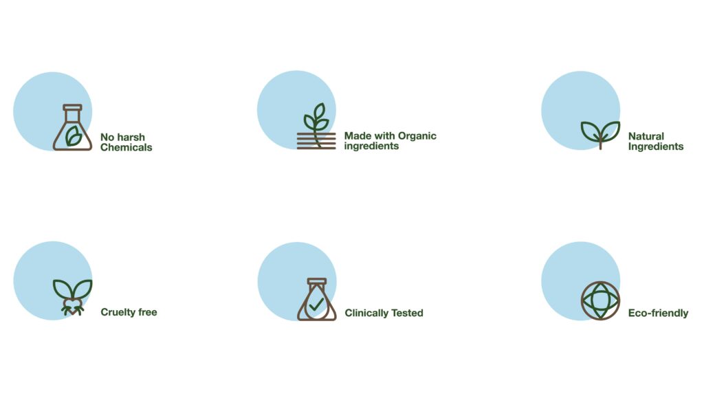
Natural, Eco-friendly, High-quality and Sustainability.
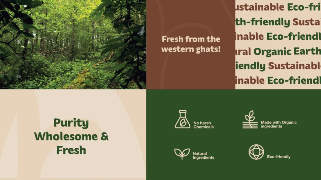
Tone of Voice – Purity, Wholesome, Fresh, Caring and Rejuvenate.
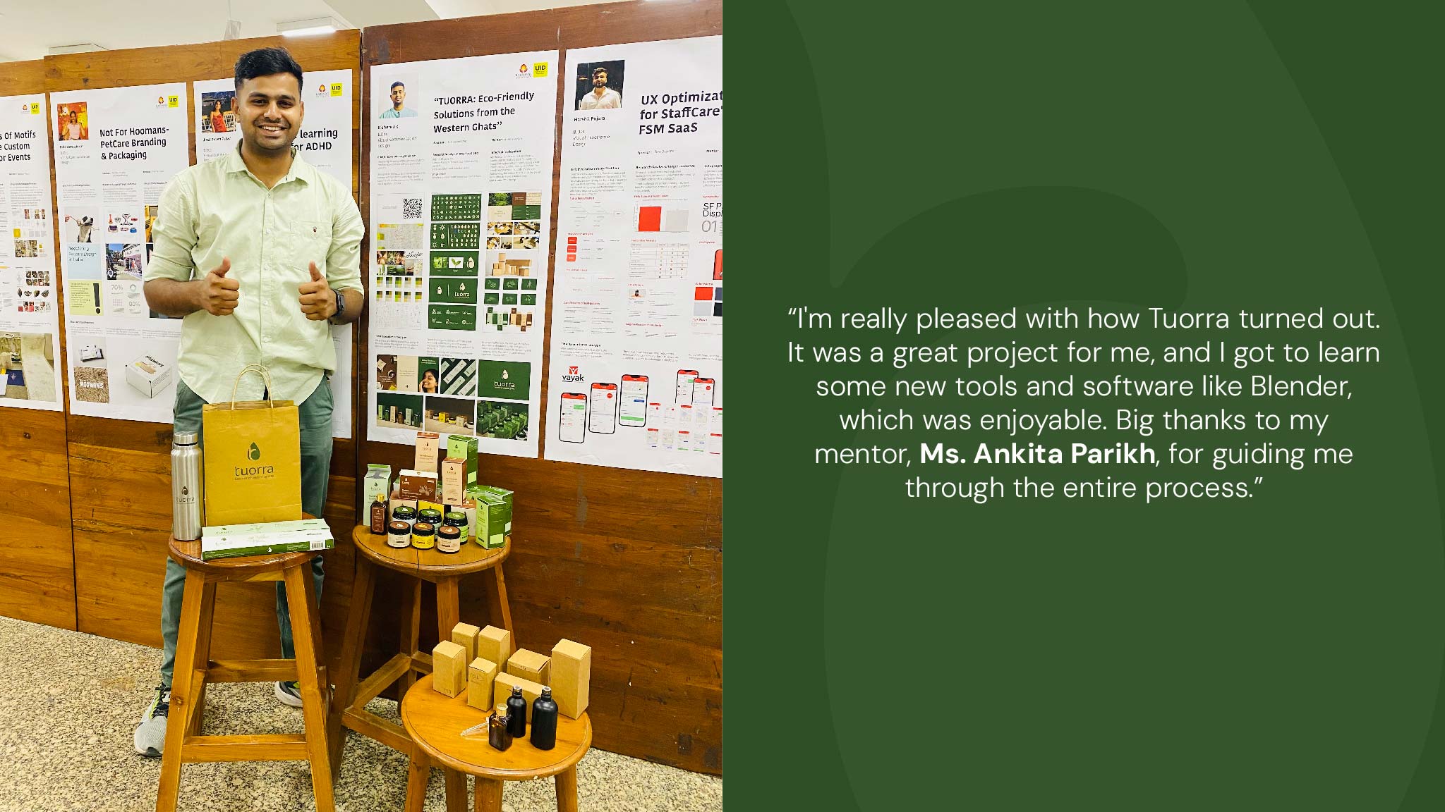
Software used – Photoshop, Illustrator, Indesign, Figma and Blender.
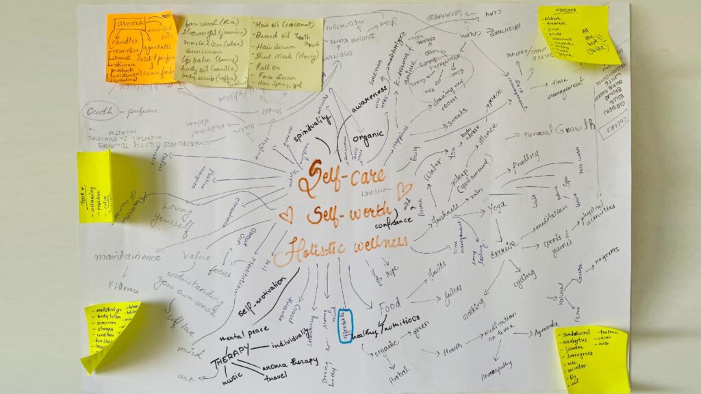
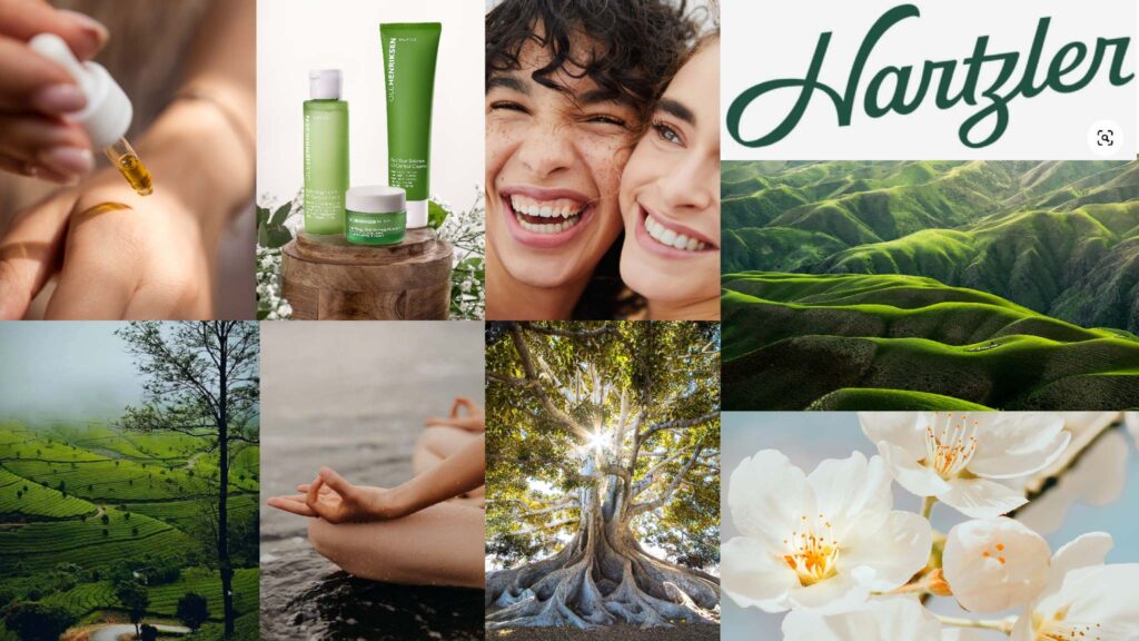
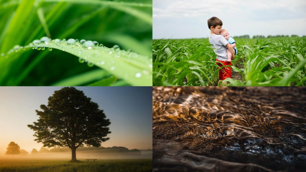
Moodboard
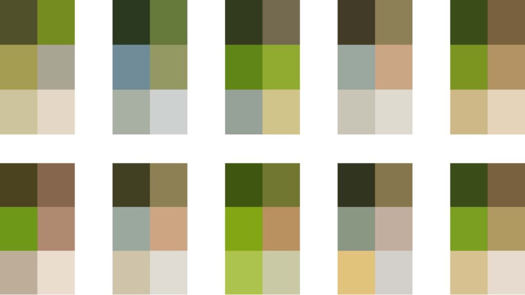
Colour Exploration
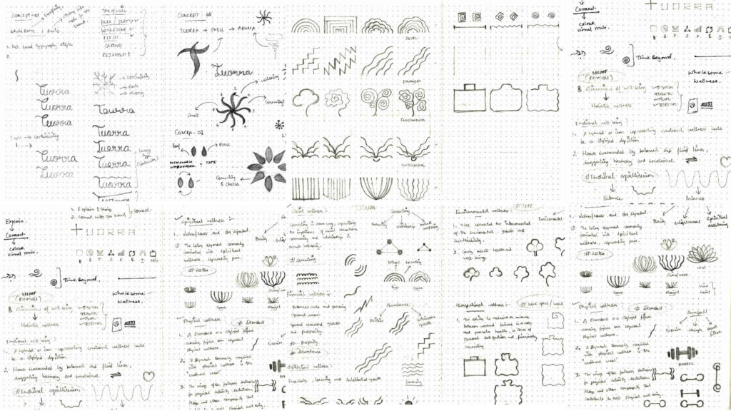
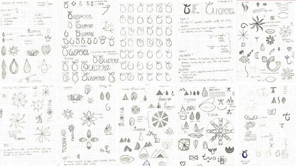
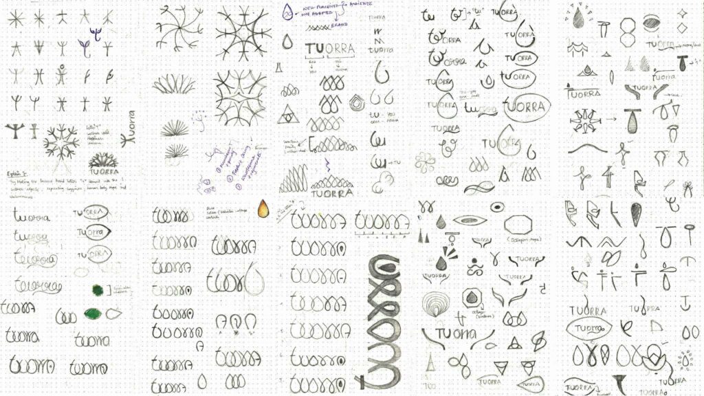
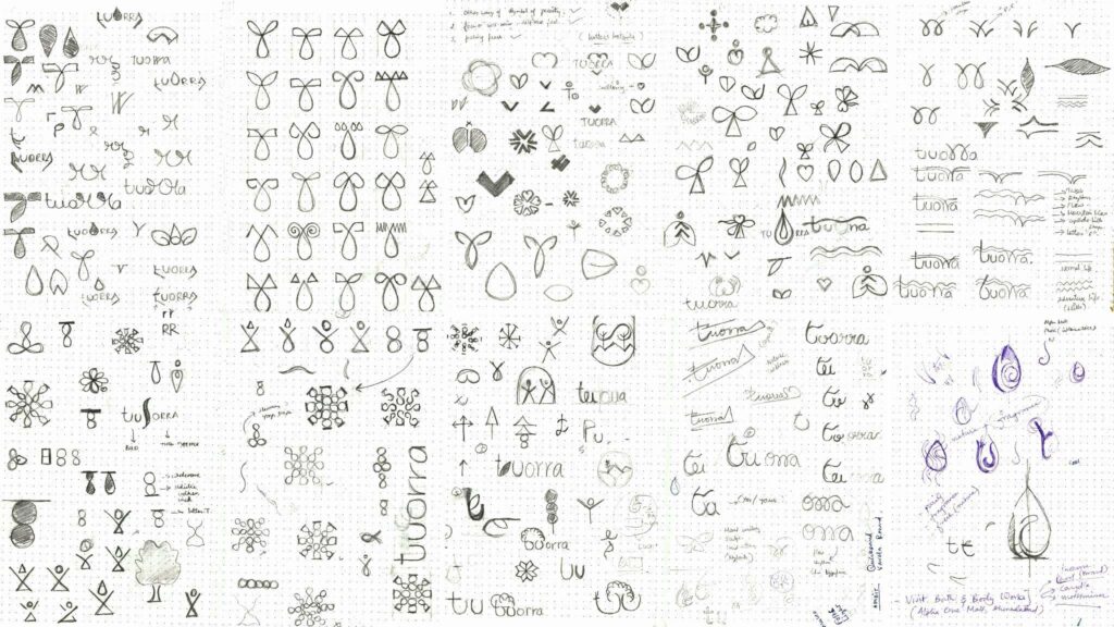
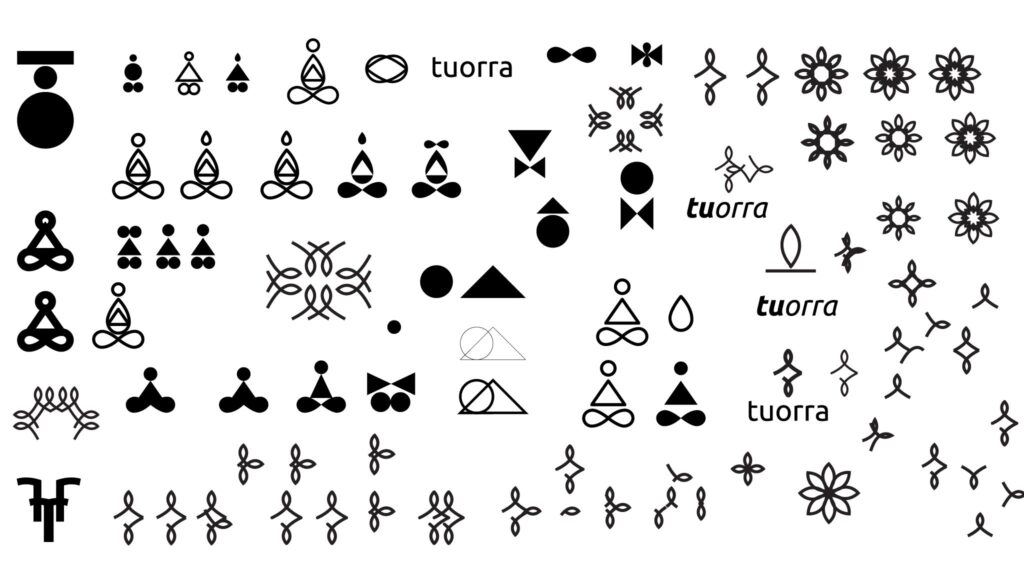
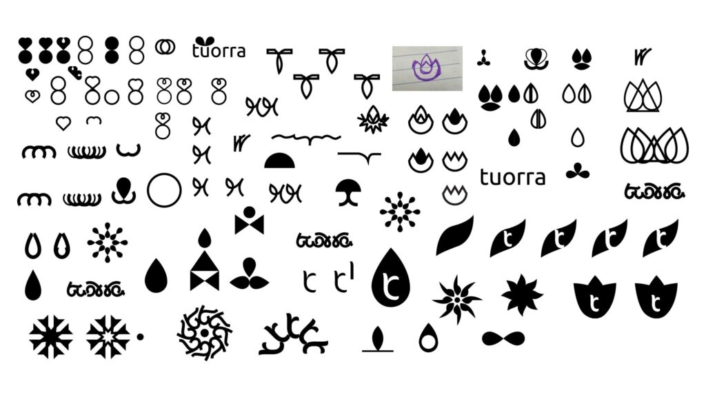
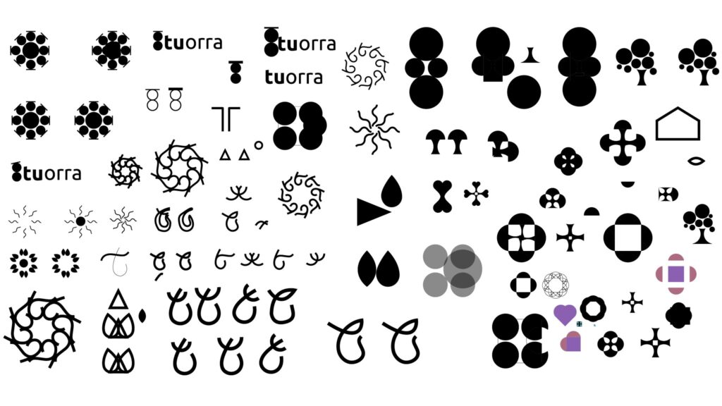
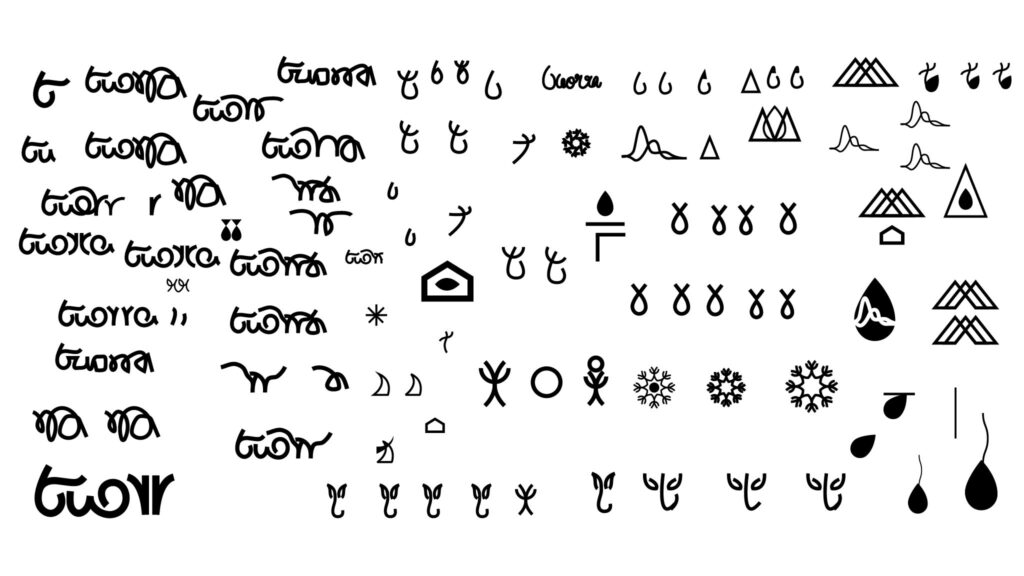
Sketch
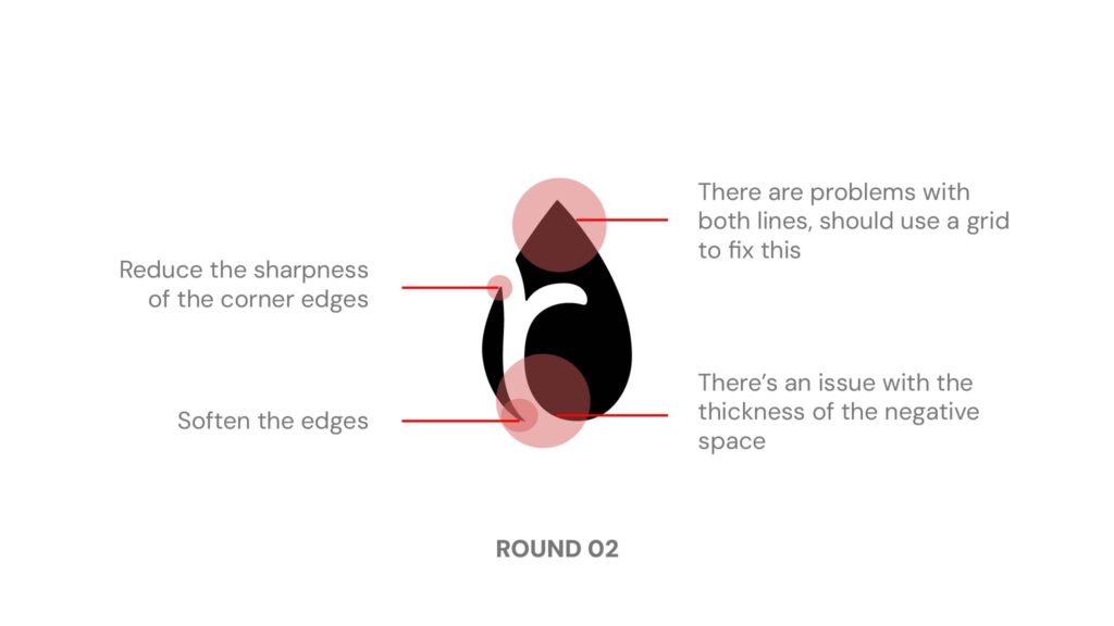
These hand sketches represent initial explorations to develop the brand’s visual identity. It’s a work in progress, with over 45 pages of sketches, as we strive to find the perfect form for the brand.
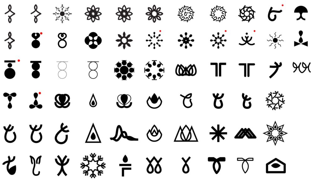
Explorations
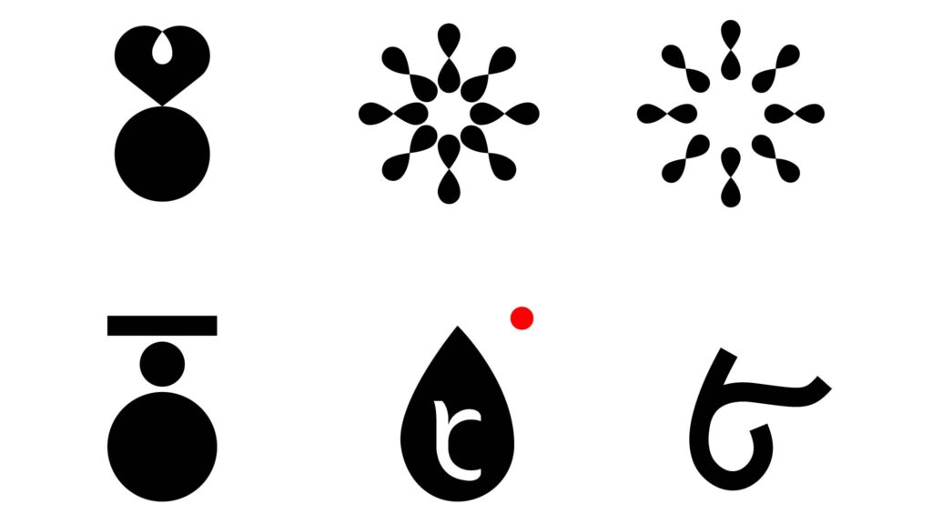
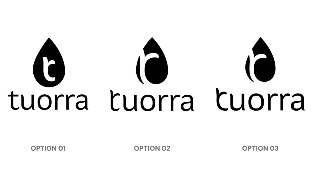
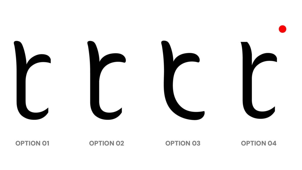
Logo Ideation
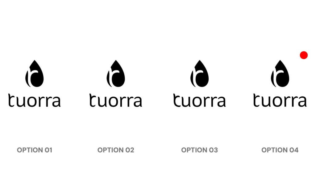
Selected Logo Ideation
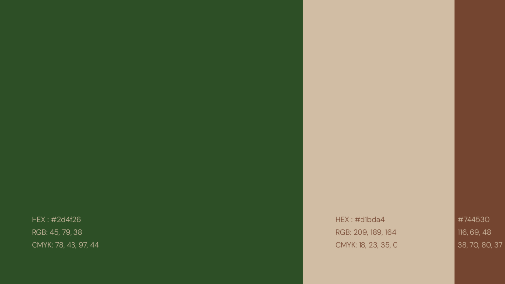
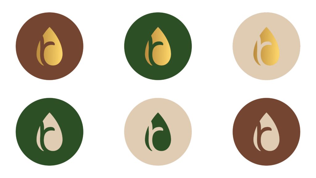
Colour Palette
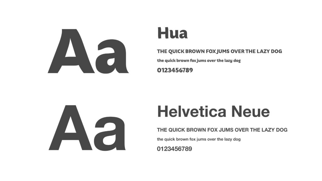
Typography
Brand characteristics
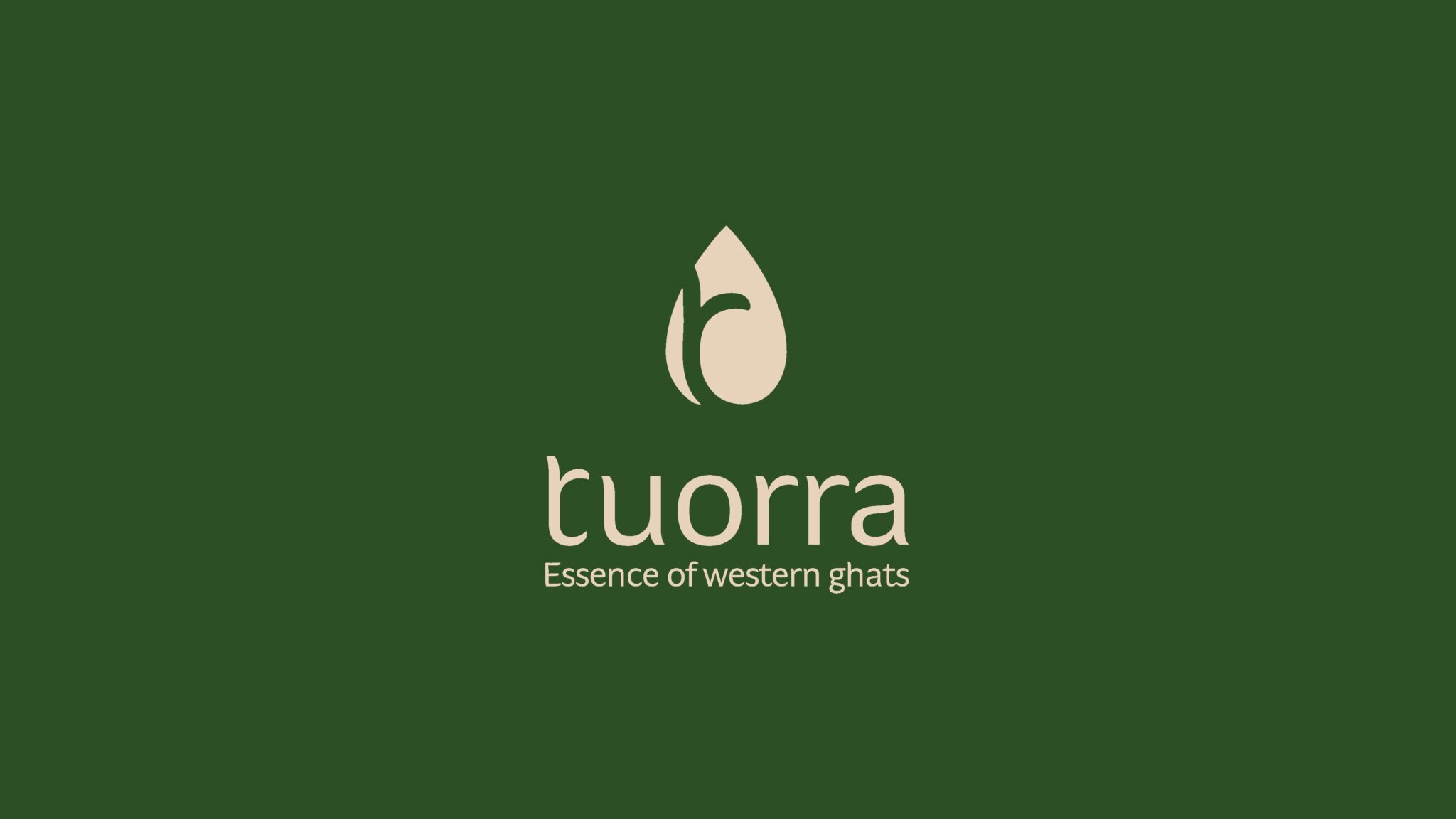
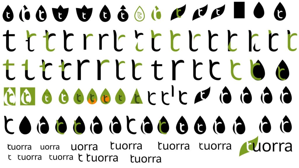
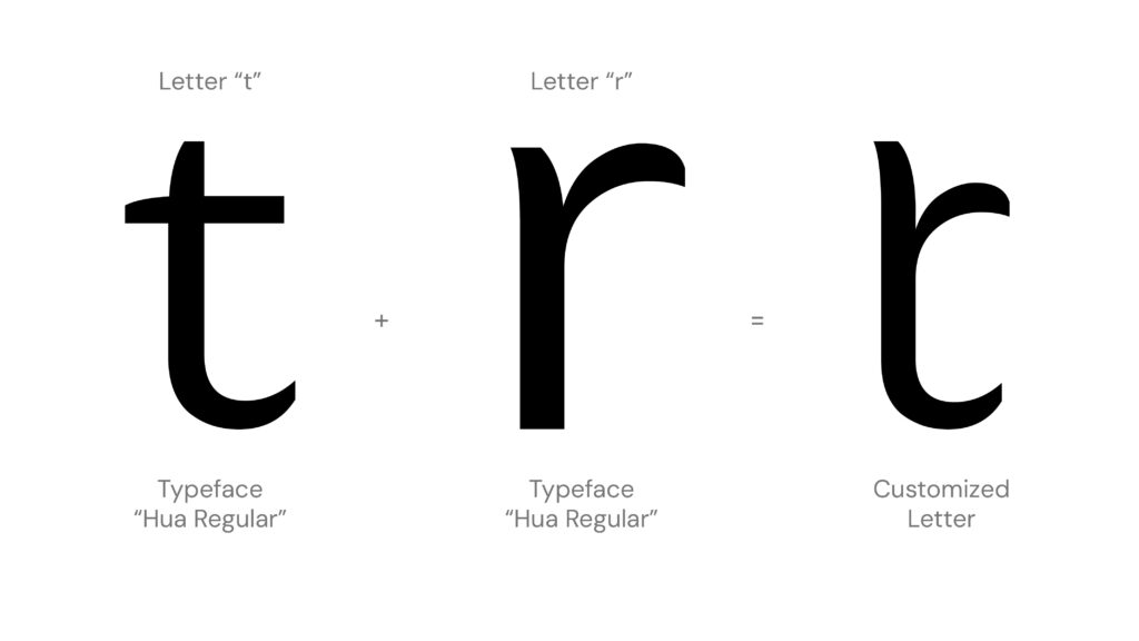
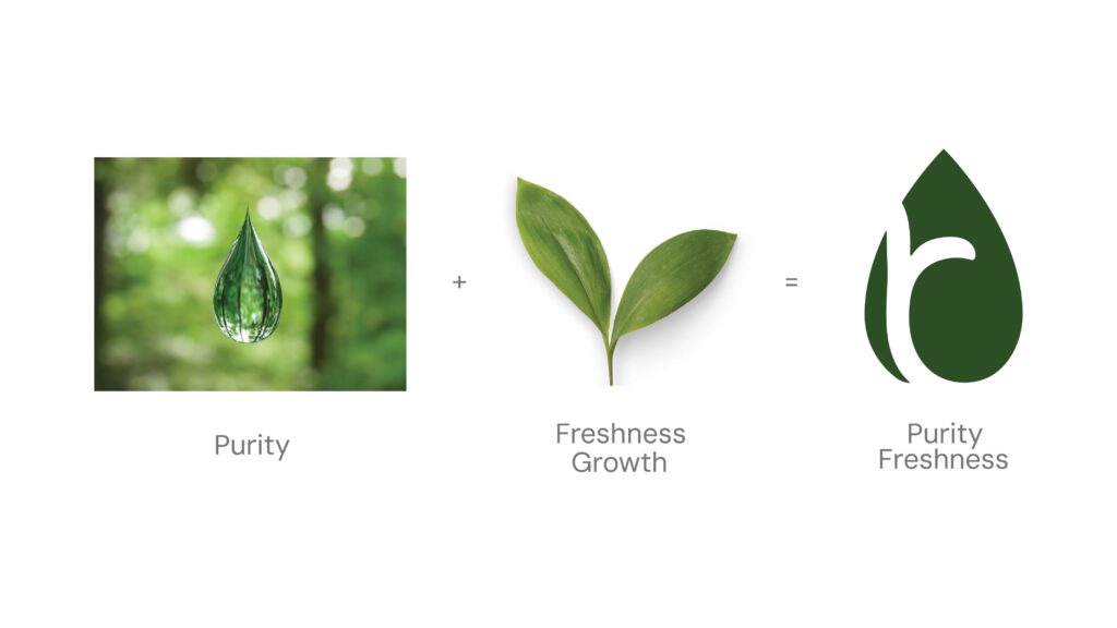
Logo Concept
Purity, Wholesome, Fresh, Caring and Rejuvenate.
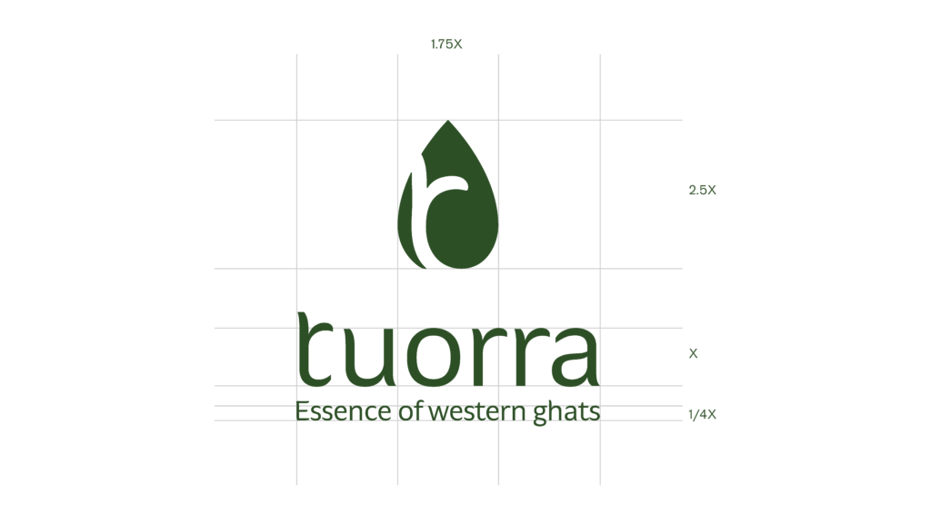
A single leaf cradles a drop, symbolizing purity. The form subtly integrates the letter “t” to represent the brand. This design evokes the brand dedication to natural essence.
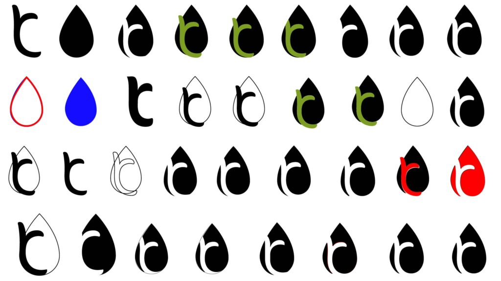
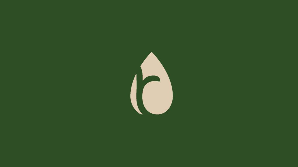
Brandmark
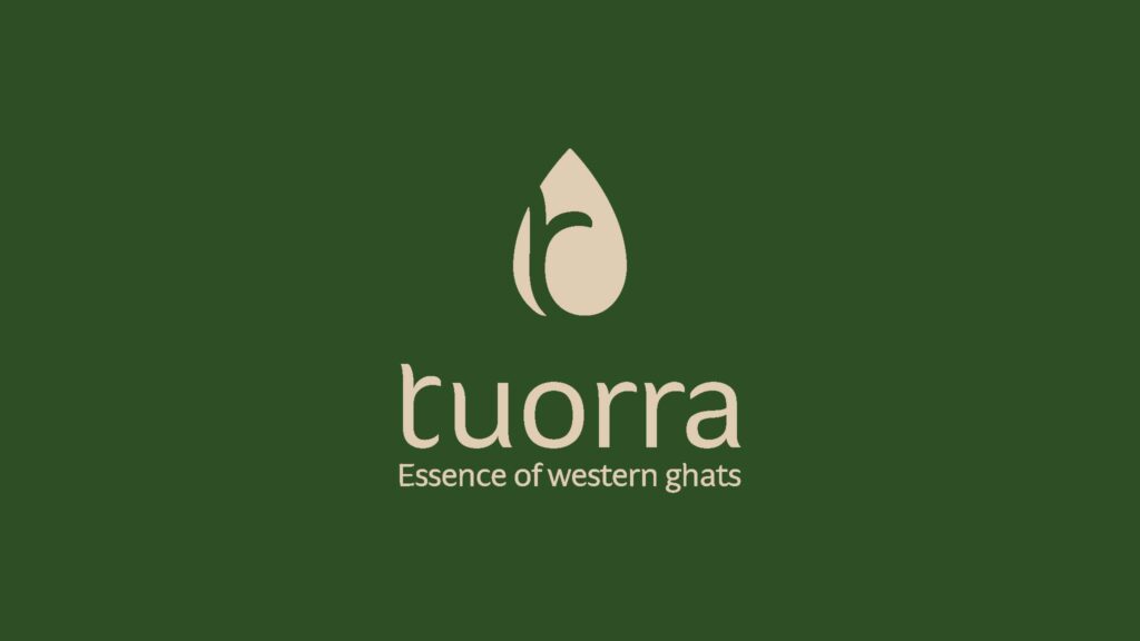
Logo
Background
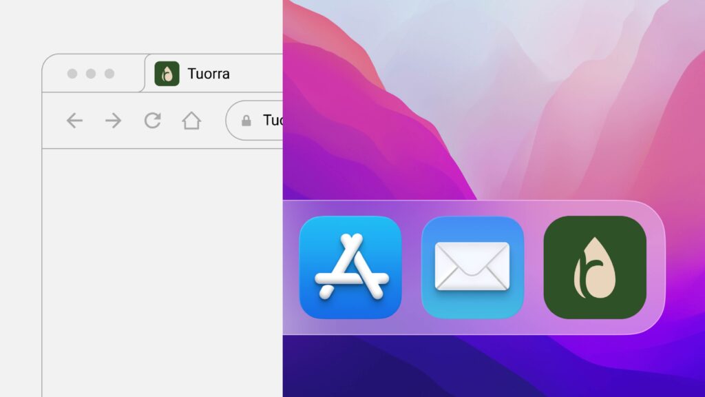
Favicon and macOS app dock
Construction
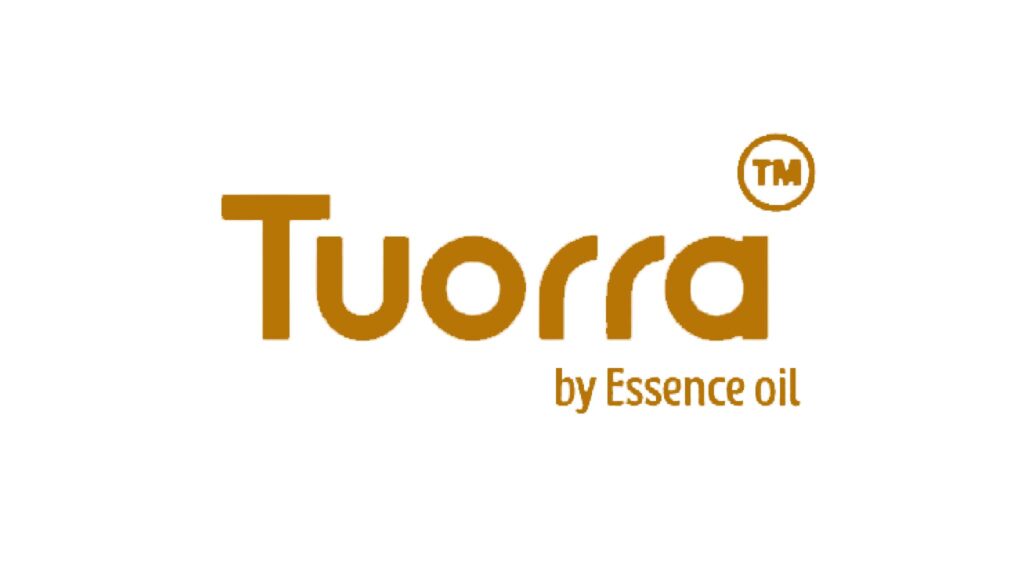
Left: Old Logo
Right: New Logo
Bento Grid
Credits: Soniya and Kanishk
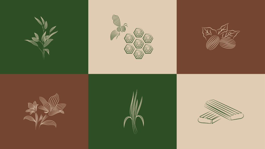
Icon sets
Illustration
Linocut Look Illustration
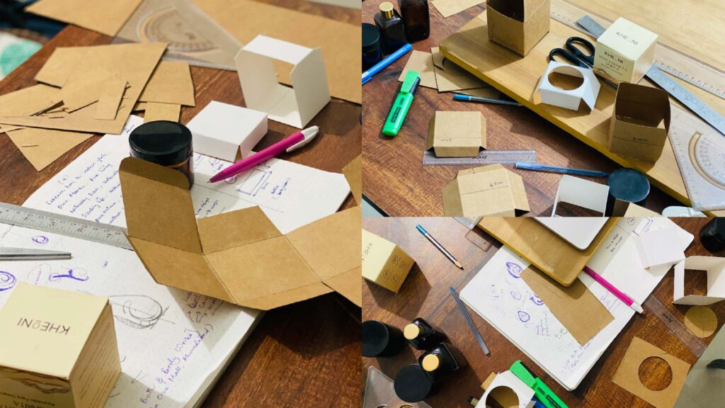
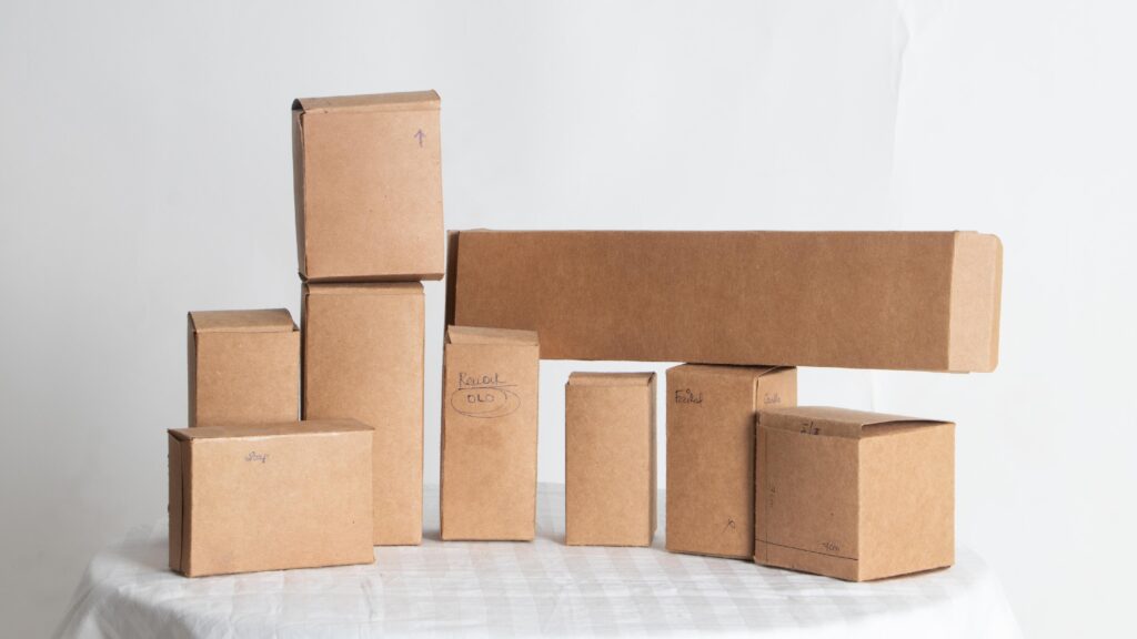
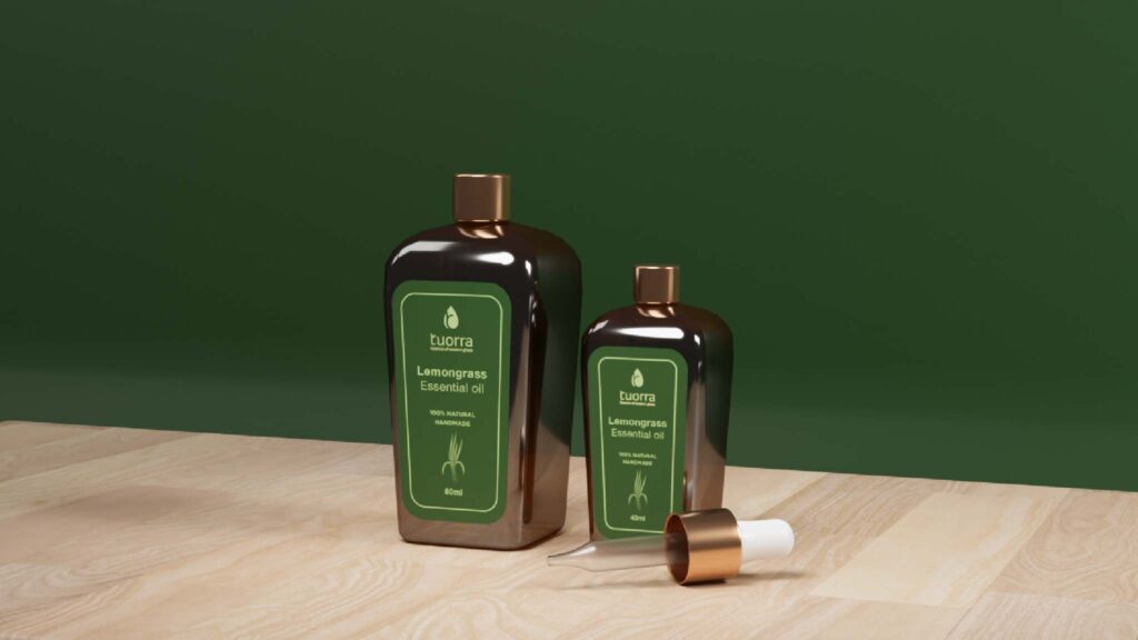
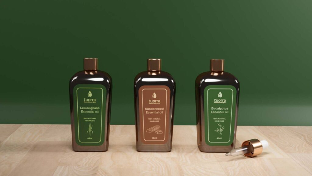
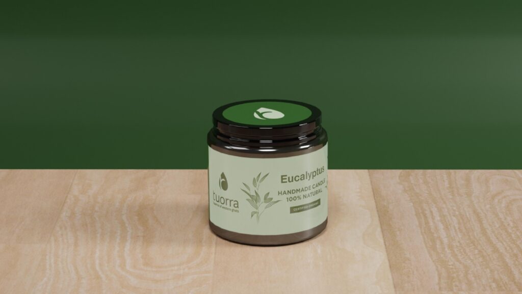
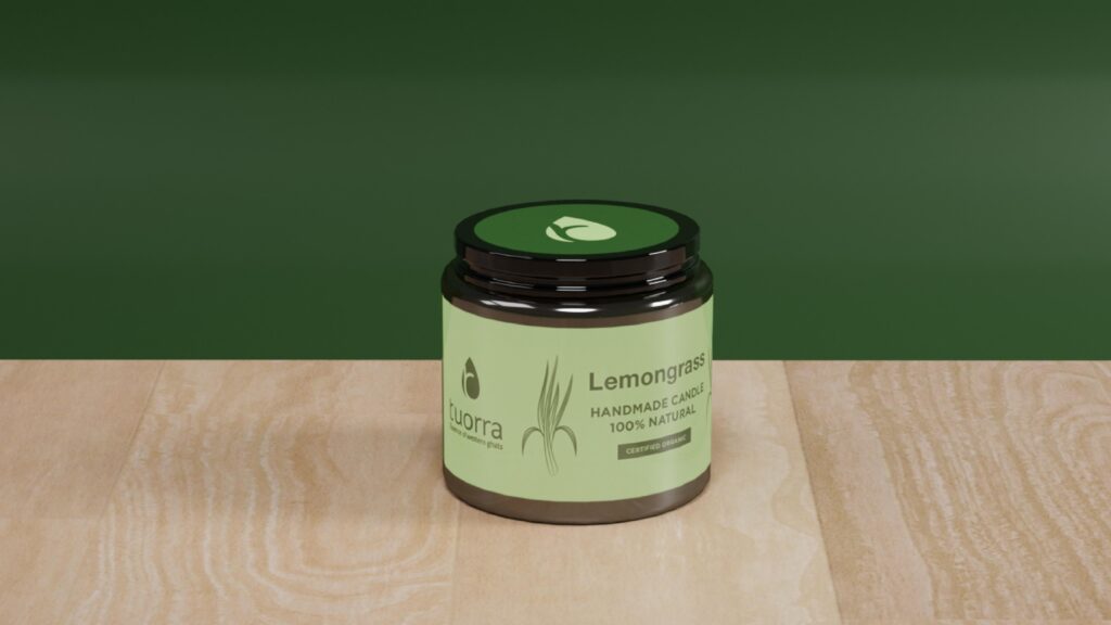
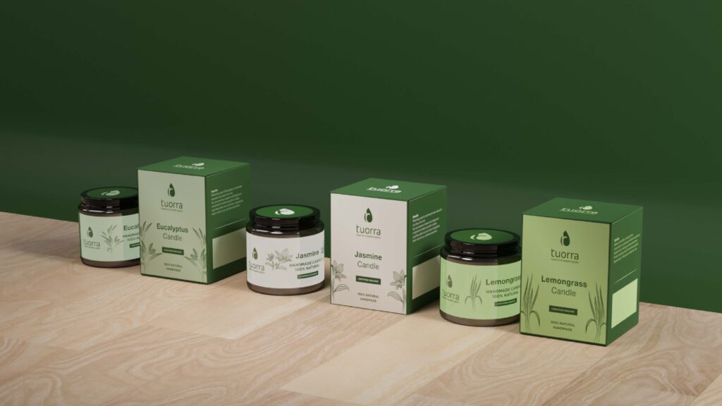
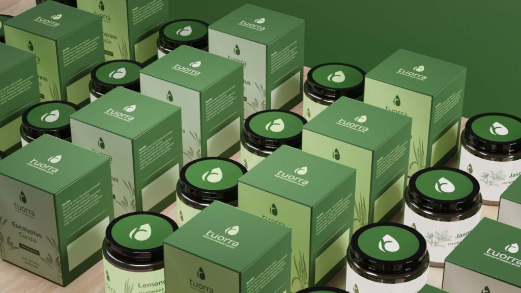
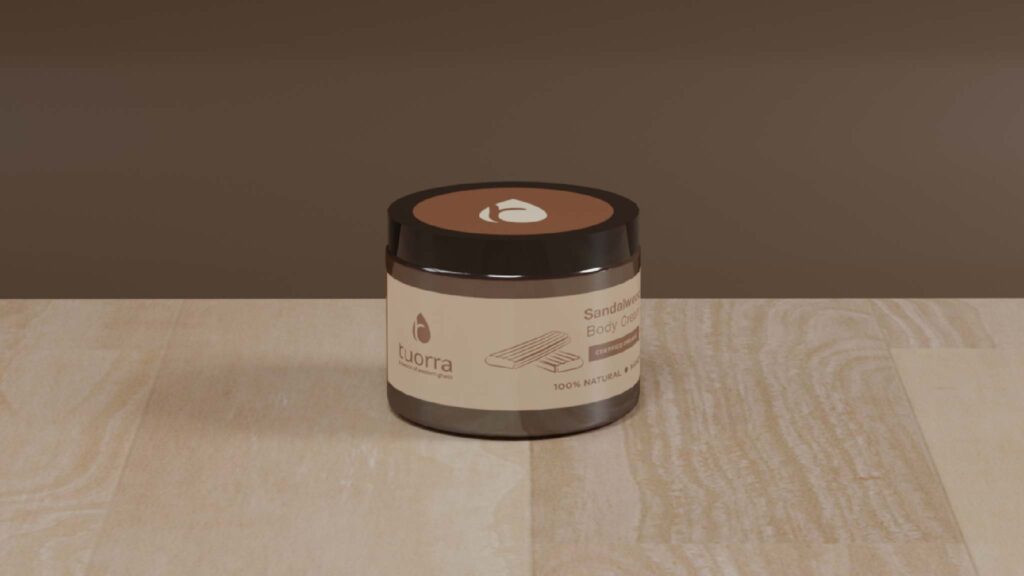
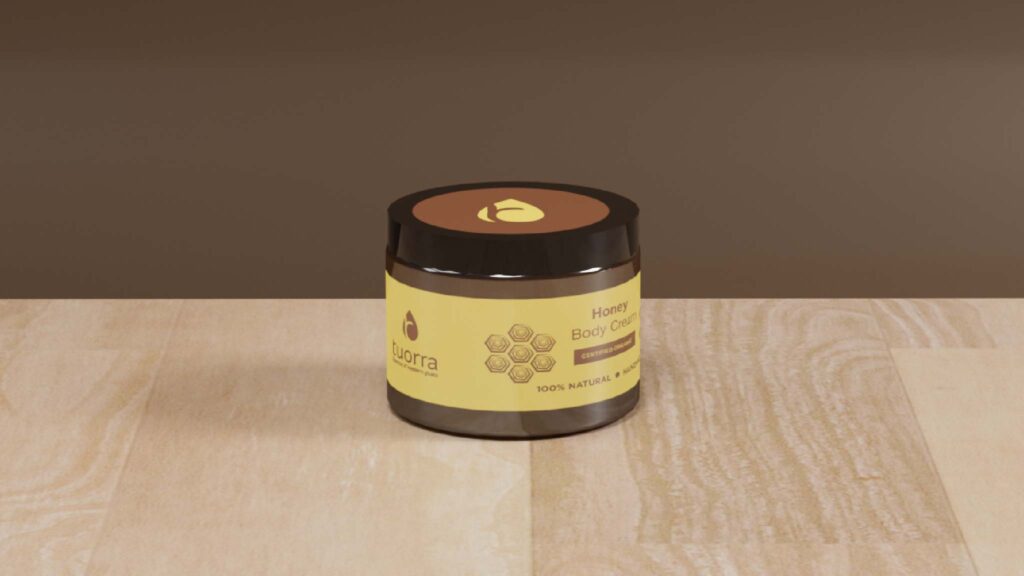
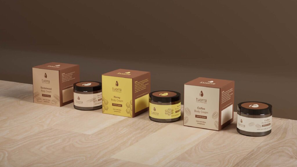
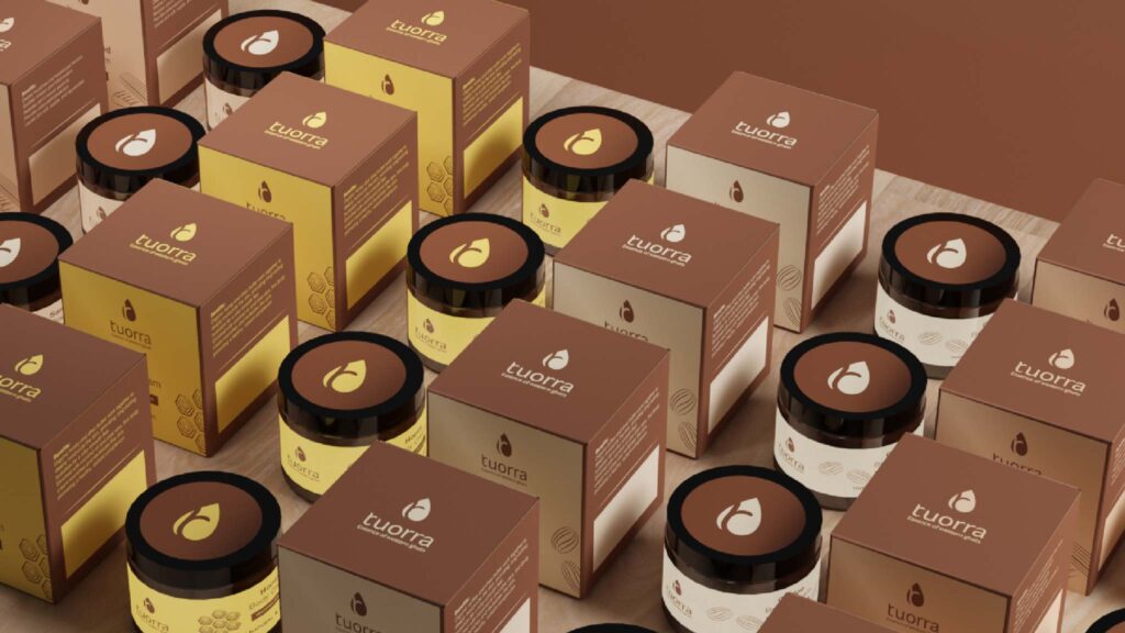
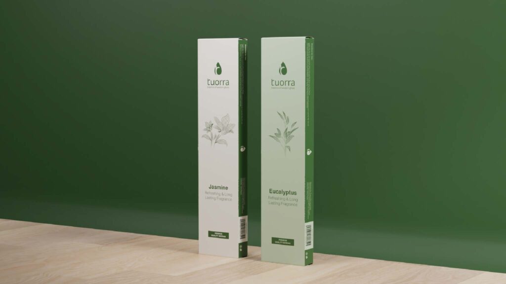
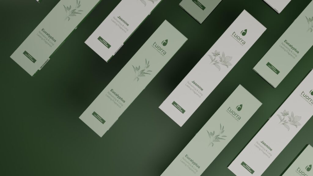
Packaging Progress
Prototyping
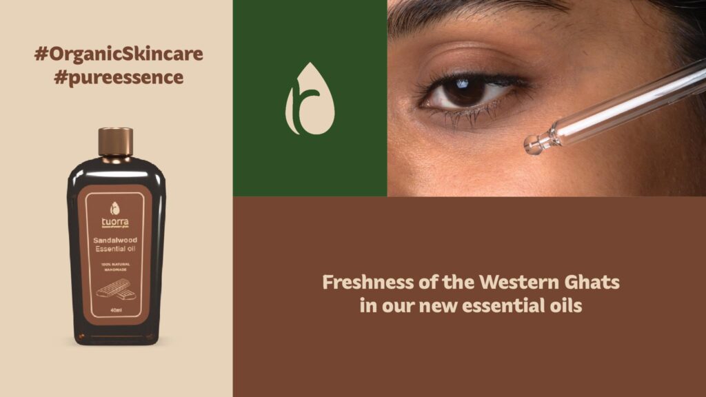
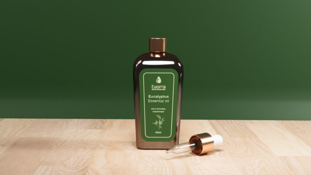
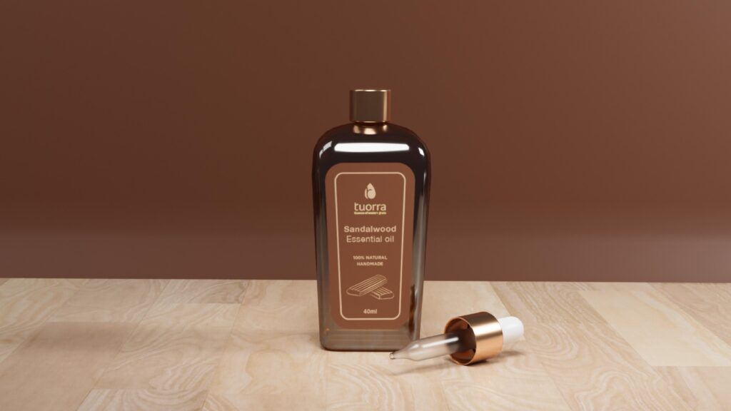
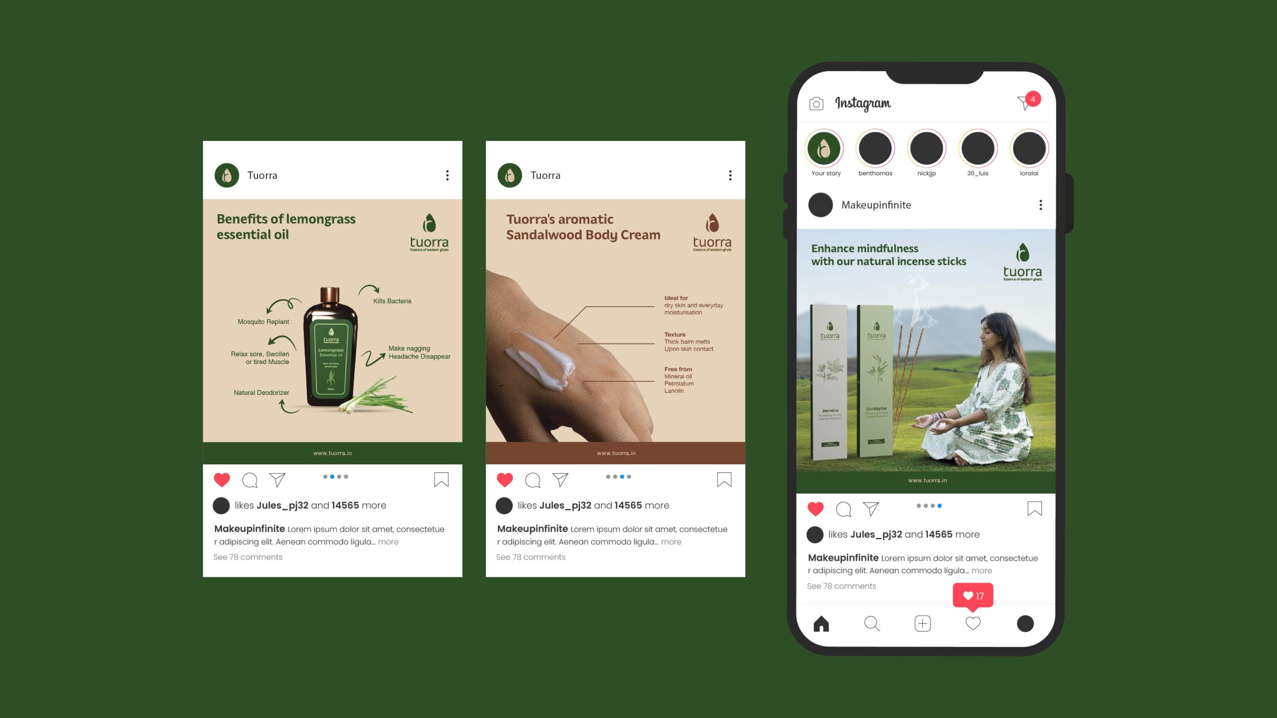
Product – Essential oil, Body cream, Candle and Incense sticks.