Wizwin

BRAND IDENTITY DESIGN

Project Mentor

Abhrojit Boral

Project Duration

1 Month

Deliverables

Brand Identity

An Edutech Company

 About Brandground of the organisation / Offering

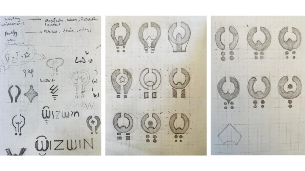
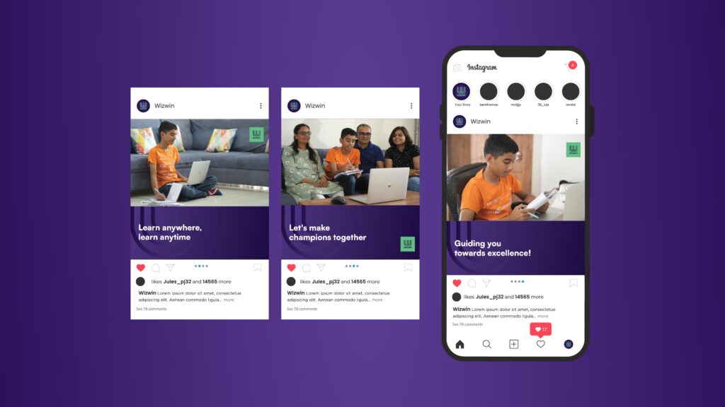
Wizwin is a new Edutech start-up company that has entered the growing edutech segment. The differentiator that Wizwin offers is that the platform gives personal attention to each student. It is aimed at new-gen parents who do not believe in rote-learning, but rather want their children to learn through understanding of core concepts. The Wizwin curriculum covers all topics of various boards in the country, but deploys them through concept driven modules. They focus on science and mathematics across ICSE, State boards and CBSE curricula. Wizwin modules are delivered as recorded lectures via its app. Students can additionally sign-up for a question answer session by booking a slot to solve queries.

There is a 24×7 chat available with subject experts to solve minor difficulties before the question-answer slot is booked. After listening to a recorded lecture, the student has to solve problems / questions. The app tracks progress of the student across topics, as well as across a subject. It highlights areas of recurrent errors so the student can study smart, rather than just hard. The app also provides sample exam papers. Mock exams can be taken by students by pre-booking an invigilated slot. These exam papers are graded and marks are available on the app.

Brand Archetype

Learning smartly to win

This positioning statement emphasizes that the platform and app are geared towards new-age learning, which is not just about working hard, but also about working smart and efficiently to get the desired results.

Audiences / key stakeholders

Internal: Promoters
External: Students, parents and teachers.

Vision

Transforming learning processes and learning outcomes for students.

Mission

We source pure Western Ghats ingredients, craft premium natural products sustainably, and empower local communities while educating about wellness and biodiversity.

Branding pillars

Smart, insightful, study-buddy.

Competitors

Byju’s, Khan Academy, Brilliant etc.

Tone of Voice – Insightful, Engaging, Education, Progress.

Logo Concept – Wizwin is an Education Platform. They are three lines in the logo each representing three stakeholders of this brand. The Typeface of the “Wizwin” is created in pen tool with the stroke of 10pt, placed equidistant to each other creating the letter “w”.

Sketch

These are the rejected ideation sketches. It was rejected because it looks like a toilet icon, doesn’t look like a bulb, and does not represent education. The idea of this sketch is a Bulb, Questions, and becoming a star.

Explorations

This is the Idea of my first concept, which my mentor rejected because the shape looked like toilet seats and didn’t look like a Bulb. However, the yellow icon, which was highlighted, is my favorite because the concept matches, but visually it doesn’t look good.

Failed attempt.

Colour Palette

Typography – The heading typeface Satoshi Black should always be bolder than the body text, Sathoshi Regular.

Reversed logo – The logo is to use against Dark backgrounds.

Reversed logo – The logo is to use against Light backgrounds.

Icon – There are three types of icons which is used in “Dual tone” and I created few icons which are important using Dual tones.

App Icon – The mockup shows how the the application app icon will look when the users use it on their mobile phones. 

Brand Collaterals – Graphic Anchors, Bag, Pin Badge, Book, Calendars.

Graphic Anchors

Bag

Pin Badge

Book

Calendar